Communicating Insights Effectively with Data Visualisation

In today’s data-driven business landscape, the ability to extract meaningful insights from vast amounts of information is crucial for success. However, insights alone are not enough. Effectively communicating those insights to various stakeholders is equally important. This is where data visualisation comes into play. By transforming complex data sets into visual representations, data visualisation tools enable businesses to convey insights in a clear, concise, and engaging manner.
The Role of Data Visualisation in Insightful Communication
Data visualisation serves as a bridge between raw data and actionable insights. It simplifies complex information, making it easier for stakeholders to understand and interpret. Visualisations also aid in data storytelling, helping to weave a narrative around the insights and making them more relatable. By using visual tools, businesses can democratise data-driven decision-making, ensuring that everyone, regardless of their technical expertise, can comprehend and contribute to the process. Moreover, data visualisations help overcome cognitive biases by presenting objective information in a visually appealing manner, fostering better understanding and reducing subjective interpretations.
Choosing the Right Data Visualisation Tools
When it comes to selecting data visualisation tools, there are numerous options available. From basic charting libraries to advanced analytics platforms, the choice depends on project requirements, technical expertise, and budget. It’s crucial to consider factors such as versatility, compatibility with various data formats, ease of use, and the ability to create interactive visualisations. User-friendly tools that require minimal coding knowledge can empower non-technical users to create compelling visual representations and facilitate collaboration between teams with different skill sets.
Designing Effective Visualisations
A. Guidelines for creating visually appealing and informative charts, graphs, and infographics
When designing visualisations, it is crucial to follow certain guidelines to ensure they are visually appealing and informative. Firstly, keep the design simple and uncluttered, avoiding unnecessary decorations or excessive data points that may confuse the audience. Secondly, choose the appropriate chart or graph type that best represents the data. For example, bar charts are ideal for comparing different categories, while line graphs are suitable for showing trends over time. Infographics can be used to convey complex information in a visually engaging manner, combining text, images, and graphics. Lastly, use consistent and intuitive labelling, titles, and legends to facilitate understanding and interpretation.
B. Understanding the importance of choosing the right visualisation type for the data
Selecting the right visualisation type is essential for effectively conveying the intended message. Different data types and relationships call for specific chart or graph types. For instance, if you want to compare quantities, a bar or column chart is more appropriate, while if you aim to show the composition of a whole, a pie chart or stacked bar chart may be more suitable. Understanding the strengths and limitations of each visualisation type helps in accurately representing the data and maximising comprehension.
C. Best practises for selecting colours, fonts, and layout for optimal clarity and engagement
The choice of colours, fonts, and layout significantly impacts the clarity and engagement of a visualisation. Opt for a colour palette that is visually appealing and allows for easy differentiation of data points or categories. Use contrasting colours to enhance readability and ensure colourblind-friendliness. Similarly, select fonts that are legible and consistent throughout the visualisation. Additionally, pay attention to the layout by organising the elements in a logical manner and utilising white space effectively to avoid visual clutter.
D. Leveraging interactive features and storytelling elements to engage the audience
Interactive features and storytelling elements can greatly enhance the impact of data visualisations. Interactive elements such as tooltips, filters, and drill-down options allow users to explore the data further and gain deeper insights. Storytelling techniques, such as sequencing the visualisations in a narrative flow or incorporating annotations, help to guide the audience through the data story and keep them engaged. By providing interactivity and storytelling, visualisations become more immersive and foster a stronger connection between the audience and the data.
Enhancing Communication through Interactive Visualisations
A. Advantages of interactive data visualisations in engaging stakeholders
Interactive data visualisations offer numerous advantages in engaging stakeholders. They enable users to actively participate in the exploration and analysis of the data, empowering them to derive insights based on their specific needs and interests. Interactivity promotes a sense of ownership and involvement, leading to increased engagement and understanding of the data. Furthermore, interactive visualisations encourage collaboration and facilitate discussions among stakeholders, fostering a shared understanding of the insights and promoting informed decision-making.

B. Exploring the use of filters, tooltips, and drill-down options to provide deeper insights
Filters, tooltips, and drill-down options are powerful interactive features that enable users to delve deeper into the data and uncover valuable insights. Filters allow users to selectively view specific data subsets or categories, helping them focus on the information relevant to their analysis. Tooltips provide additional context and details about individual data points, offering a comprehensive understanding of the underlying information. Drill-down options enable users to navigate through different levels of detail, from an overview to a more granular view, revealing patterns and relationships that might not be apparent at first glance.
C. Showcasing real-time data updates and the importance of dynamic visualisations
Real-time data updates are essential in dynamic environments where the information changes frequently. By showcasing real-time data in visualisations, businesses and stakeholders can stay up to date with the latest insights and make timely decisions. Dynamic visualisations that automatically refresh or respond to changes in the underlying data create a sense of relevance and urgency, ensuring that the information presented remains accurate and actionable.
D. Demonstrating the power of dashboards in delivering comprehensive insights at a glance
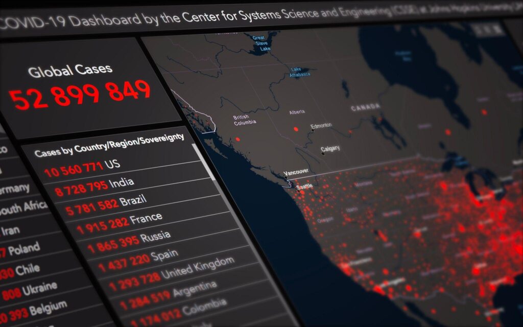
Dashboards serve as centralised hubs for data visualisations, providing stakeholders with a comprehensive overview of key metrics and insights at a glance. By combining multiple visualisations into a single interface, dashboards enable users to monitor various aspects of their business or operations simultaneously. Well-designed dashboards use visual cues, such as colour coding and alerts, to highlight important trends or anomalies, allowing stakeholders to quickly identify areas that require attention. The ability to customise and personalise dashboards empowers users to focus on the specific information that is most relevant to their roles or responsibilities.

Common Data Visualisation Challenges and Solutions
A. Addressing potential challenges related to data quality and cleanliness
Data quality and cleanliness can pose challenges in data visualisation. Inaccurate or incomplete data can lead to misleading visual representations and incorrect interpretations. To address this, it is essential to perform data validation and cleaning processes before creating visualisations. This includes checking for missing values, outliers, and inconsistencies, and taking appropriate steps to handle or rectify them. Collaborating with data experts and subject matter specialists ensures that the data used for visualisation is accurate, reliable, and suitable for the intended purpose.
B. Dealing with large and complex datasets and ensuring scalability
Large and complex datasets can present challenges in terms of scalability and performance when visualising the data. It is crucial to consider the limitations of the visualisation tools and platforms being used and optimise the visualisation techniques accordingly. Techniques such as data aggregation, sampling, or summarisation can help simplify and condense large datasets without sacrificing important information. Additionally, leveraging advanced technologies such as parallel processing or cloud-based solutions can enhance scalability and enable efficient visualisation of big data.
C. Navigating the ethical considerations of data visualisation and preserving data privacy
Ethical considerations in data visualisation involve ensuring the responsible and ethical use of data. This includes obtaining informed consent when using personal or sensitive data, anonymising or aggregating data to preserve privacy, and adhering to data protection regulations and industry standards. Transparency regarding data sources, methodologies, and limitations is essential to maintain trust and avoid misinterpretations. By prioritising data ethics and privacy, businesses can foster a culture of responsible data visualisation and build stronger relationships with their stakeholders.
D. Strategies for effectively communicating uncertainties and limitations of the data
Data visualisation should always acknowledge and communicate uncertainties and limitations associated with the data. It is crucial to provide contextual information, such as confidence intervals or margin of errors, to indicate the reliability or uncertainty of the insights presented. Additionally, clear and concise explanations of the data’s limitations, such as data collection biases or sample size restrictions, help stakeholders understand the boundaries within which the insights should be interpreted. Honest and transparent communication of uncertainties promotes a more accurate understanding of the data and avoids potential misinterpretations.
Conclusion
Data visualisation plays a critical role in effectively communicating insights by transforming complex data into accessible and meaningful visual representations. It enables businesses to present information in a clear, concise, and engaging manner, facilitating comprehension and enhancing decision-making processes. Through visualisations, patterns, trends, and relationships within the data become more evident, empowering stakeholders to gain actionable insights and drive informed actions.
The field of data visualisation is continuously evolving, and there are exciting advancements on the horizon. With the advent of technologies like augmented reality (AR) and virtual reality (VR), data visualisations have the potential to become even more immersive and interactive. Additionally, advancements in artificial intelligence (AI) and machine learning (ML) can enhance automated data analysis and generate dynamic visualisations in real-time. These developments promise to unlock new possibilities for extracting insights from data and revolutionise the way information is communicated.
By embracing data visualisation as an integral part of their communication strategy, businesses can unlock the power of data, enhance stakeholder engagement, and drive informed decision-making for a successful future.
Get your data results fast and accelerate your business performance with the insights you need today.


